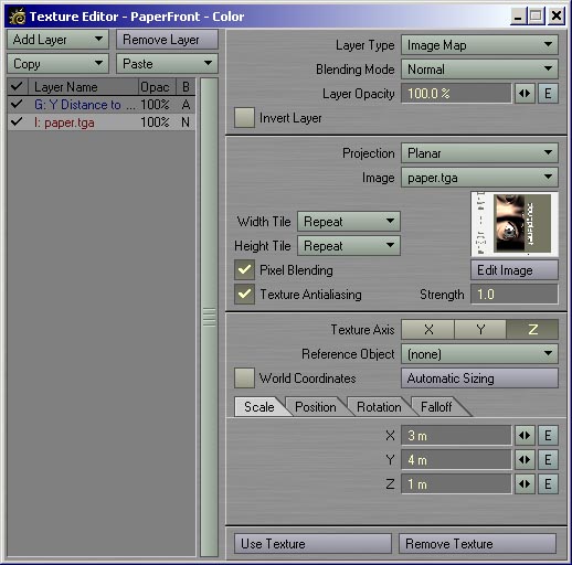
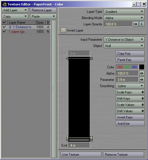
HOME : ABOUT : TUTORIALS : GALLERY : STUFF

Apr 9, 2007

RLA tutorial update... plus updates in general.

For some time now, my most popular links have been to my tutorial on using the RLA image format rendered from Newtek's Lightwave 3D in a compositing program (in this case Adobe After Effects), as well as it's real world example follow up.

For some reason, the results from the combination of the latest versions of Lightwave and After Effects seems to be broken. There's a simple workaround (use the RPF Image Filter instead of the RLA Image Filter).

Currently, I'm partially through a complete overhaul of the site (including a decent gallery), but shortly thereafter, I'll be including an all new tutorial on compositing options.

Labels: , , , ,

Nov 24, 2005

Tutorial Translation

From the "Internets are Cool" dept.

I recently got an email from the folks who run Frenchwave, a French Lightwave website. They've translated my two-part quickie tutorial on using RLA format renders in After Effects. This is the third time one of my tutorials has been translated, which is pretty cool.

Even though I post these a couple of years back, I'm glad that the RLA tutorials are still being used, and by an international audience no less.

For the record, the other two languages are Italian and Russian.

The French tutorial link can be found here.

Labels: , , ,

Oct 31, 2004

Using Lightwave RLA Exports in After Effects

Part Two - A Sample Project

UPDATE: (09 April 2007)

It's come to my attention that there needs to be a minor tweak to this tutorial. The RLA functionality between After Effect 7 and Lightwave seems to be 'broken'. For now, use the RPF Image Filter instead of RLA. I'll be doing a complete rewrite at some point in the near future, including updated functionality.

Note: This is just a quick example of controlling Lightwave's RLA information in After Effect. Here we see an image rendered in LW, and exported using the Extended RLA Image Filter, and exported to After Effects. The second image is a text element that I want to sandwich between the character and the building, using the Depth Matte Effect in After Effects...


The following is the Depth Matte, as viewable by using the 3D Channel Extract filter in AE 5.5, including the settings I picked to view it...


Note that when bringing this info from LW, After Effects defaults to using HUGE numbers for the Black/White point, such as + and - 10000. This is way to huge for most of the stuff I do, and find that even with an image with a depth of about a city block or two (about 600 metres), the numbers sit within the +200 to -200 range...

Next is the results of picking a point I want to matte, and it's setting for this particular image...


You can also feather in percentages as well. Since this is just a quick run through, I'm not being picky. :)Now to bring it all together. Below is a snip of the AE time line.


As you can see, the top layer has the Depth Matte Effect applied as per the above example. The second layer in order is the Text element I want to sandwich, and finally, another copy of the original RLA without the Depth Mattel Effect applied. Below are the results...


In Conclusion:

This is just one way to do it, but I'm sure there are others. For certain uses, you can extract the Depth Matte, then use that as a key for footage, etc etc. I don't pretend to be an expert in LW or AE, but I get paid to work with them. Since I learn a LOT from the online graphics community, I figure when I can share a little, it can only be good karma. :)

That's about it. Comment, crits etc... email me at doug@dougplanet.com

Labels: , , ,

Oct 5, 2004

Using Lightwave RLA Exports in After Effects

Part One - A Quick Tour

UPDATE: (09 April 2007)

It's come to my attention that there needs to be a minor tweak to this tutorial. The RLA functionality between After Effect 7 and Lightwave seems to be 'broken'. For now, use the RPF Image Filter instead of RLA. I'll be doing a complete rewrite at some point in the near future, including updated functionality.

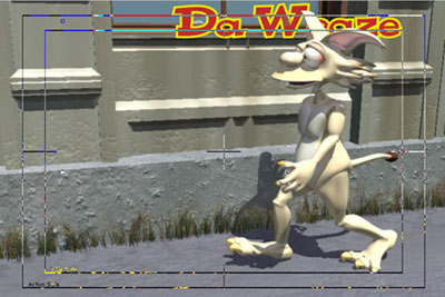
UPDATE: Since writing this, I've added a second short overview, showing a Real World (tm) example of adding a title to a scene with The RLA Exporter...Click here to skip ahead...

Note: This is just a quick example of controlling Lightwave's RLA information in After Effect.

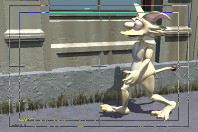
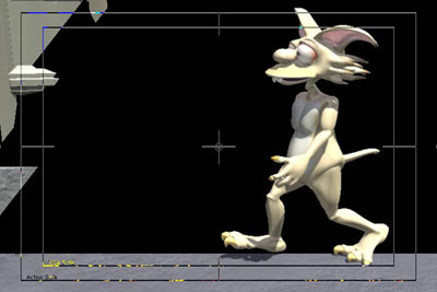
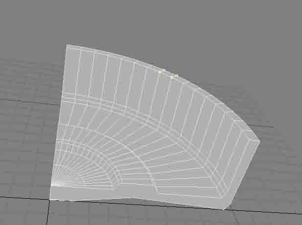
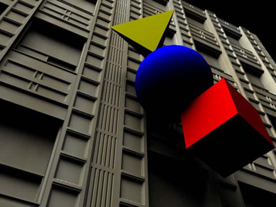
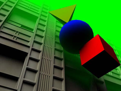
First off, the image rendered in Lightwave 7.5 contains 4 objects, each with a different surface name. The image was saved using the RLA export feature added under the image processing panel in LW. It was rendered with a single area light, no DOF (depth of field), and is more functional than pretty.

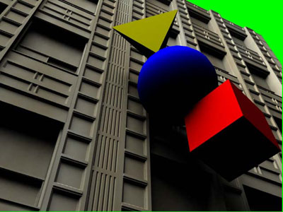
Once rendered, I created a new composition in After Effects 5.5, and imported the image, using the premultiplied matte.


Behind this image (the layer below the image), I placed a green solid, just so things would stand out fairly well. I don't think you need to see what a green solid looks like, but here's what the two look like comped.


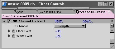
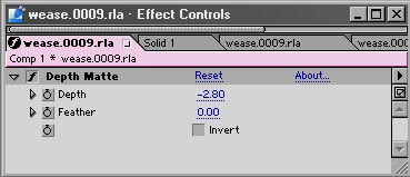
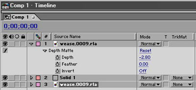
Now for the fun part. To save time, I'm just going to show the effects panel from After Effects. Each of the effects can be found under the Effects -> 3D Channel pulldown menu. Obviously, the effects are applied to the RLA image, and not the green square :)
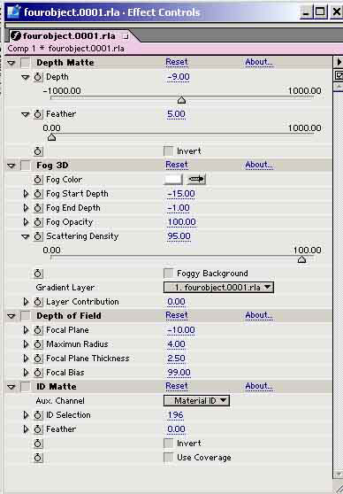
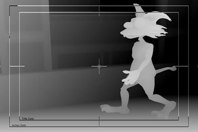
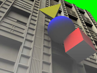

Depth Matte

The first effect is the depth matte. When applied without a feather, it looks something like this...


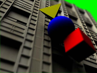
As you can see, the top of the building is being clipped out. By adjusting the slider, you can change it's position, and you can also apply a feather to it, like this...


As you can see, the background colour is creeping in behind the forground square, and the feather tool does a nice job of it.

3D Fog

The next feature is 3D Fog. It's pretty straight forward as well. Basically, using the depth data, you can apply a simple colour fog to the image, such as this...


There are options to apply gradients, and other funky features, but I'll leave that to you to explore.

Depth of Field

This one is a little cooler. Instead of rendering DOF in LW, or using a 3rd party plug-in, you can just fix it in post. Now, I'll be the first to agree that this kind of DOF is in NO way as accurate as real, rendered DOF, but you know what? Who cares? Seriously. For some work, real DOF is an important issue, especially for higher resolution work, such as film or print. But for a lot of video resolution stuff, it's not that important. It can enhance


Personally, I feel that DOF is a camera artifact that many cinematographers try to overcome as much as possible in most shots. In certain cases, DOF can be used as a storytelling technique (or when done badly, a gimmick), but having everything crisp to start off with is much better than being stuck with stuff that's too out of focus to start with.


Anyhow, here's an After Effects DOF image. :)


The DOF feature doesn't take into account occlusion (the colour of objects behind foreground objects when applying the blur). That can be limiting in some instances, but at the same time, it is more than up to the task for many jobs. For example, if you have a landscape background rendered in a separate layer from foreground objects/characters, it's a lot faster and easier to control in AE than it is to test renders, and have to redo scenes in LW.
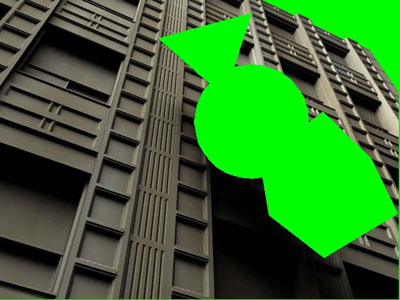
ID Matte


This is a pretty cool one as well, and needs a little explanation before getting to it. Firstly, there are a couple of issues with selecting objects. I couldn't figure out how to get it to work. I'm not sure if this is an issue with LW's RLA export or AE's ID Matte plug-in, however. If you change the option in AE from Object ID to Material ID, it seems to work well, however.

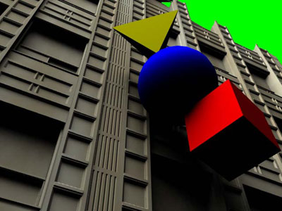
Also, once you apply the effect, you must click on the image (while the effect is still highlighted) to select the material info you want to extract. In this first example, I've clicked on the building, and you can see that it matted fine.


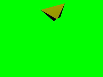
Just for fun, here's what it looks like when the triangle is selected.


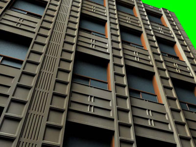
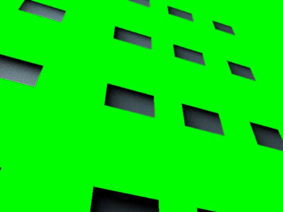
Now, what about a single object with multiple materials? Funny you ask that, because the original version of the building had multiple surfaces (materials). There is the concrete of the structure, the window sills, and two separate glass surfaces, one for the big upper windows, and one for the smaller windows that open and close. Here's what the original looks like...


Now, if I selected just the concrete surface (material), this is what it looks like.


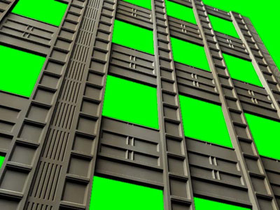
Like many effects in AE, you can invert your selection, which makes it look like this...


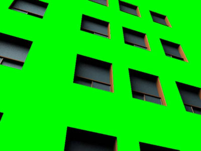
Finally, if I select the window surface alone, this is what the ID Matte looks like...


In Conclusion:

Although there seems to be some limitations to the actual RLA export (and I haven't tested it in a renderfarm environment), it does serve quite a few functions when working with AE. Most of these matting effects also allow you to feather edges (see the AE Effects panel above), and since it's just another effect, you can do all sorts of crazy stuff in post. In the end, I like the feature a LOT, but of course I would like to see it expanded.

UPDATE: Click here to see the newly added Part Two, a quick project example.

Well, that about does it for this quick trip through Lightwave's RLA export and After Effects 5.5. Let me know if you've enjoyed this by dropping me a line at doug@dougplanet.com

Labels: , , ,

Aug 14, 2002

Gradient Alpha Layer

Note: This is just a quick example of controlling gradient alphas, so there's not a lot of screen shots. In other words, this tutorial assumes you know LW basics. If you don't want to read this whole tutorial, I've included the object, image and scene file here.

Now, let's get on with the show.

1. Make a piece of paper in Modeler. For this example, I'm using a sheet of paper 3m by 4m by 10cm which is a pretty thick stack of paper, actually. But this is just an example, and you can figure it out from here :). It is centered X,Y and Z axis.

2. Name the default surface "Paper". I gave it a dark blue surface to make things more visible. Now, select just the polygon facing the Z- (Z minus) direction, and rename it "PaperFront". Give it the same surface settings though (The same dark blue).

3. Save the object as paper.lwo

4. Open Layout, and load paper.lwo

5. Add a Null and keep at it's 0,0,0 position for now. You can rename it PrintHead if you like.

6. Open the Surfaces Panel, and go the the surface "PaperFront". Click on the Texture Editor for the Color channel (the little T button to the right)

7. Make the first layer an image map, with planar projection in the Z axis. Load an image (mine's called paper.tga - a 32 bit image, we'll see later why).


(what the image layer looks like)

8. Click on Automatic size, and it will be placed there all snug as a bug in a rug.(You can do a test render of a frame right now, just to make sure it's showing up.

)9. Still in the Texture Editor, add a new Gradient Layer. Make the Blending Mode -> Alpha and the Opacity 100%.

10.. Make the Input Parameter "Y Distance to Object" Select the Null object that you may have called PrintHead.

11. Now to creat the printing effect. On the Gradient Bar, you'll see a Start (0m) and an End (10m).
a) change the End to (4m).
b) change the Start Color to black.
c) make a new key by clicking on the bar. Change it's parameter to 3.9m. Make sure it's colour is black as well.
d) make a new key below the last one.
e) change it's color to white, and make sure the parameter is 4m (equal to the End value)

12. Click on use texture. Here's what it looks like...


13. Do a "Save All Objects" and save your scene.

14. Now for testing...

a) With the Null at 0,0,0 hit F9. You'll see a blue sheet of paper, like the image below. No image at all! That's because the gradient is less than 4m away from any point (in the Y direction) of the PaperFront surface.


b) Move the null up to EXACTLY 2m on the Y axis and create a key. Do another test render. You'll see a blue sheet with a thin white strip (the image below). This is the gradient alpha in effect. The slight gradient you see is the distance between 3.9m and 4m, as set up in the gradient layer. To make the transition sharper, you can play with the distance between the two keys, or chang the default spline to Stepped or whatever suits your purposes.


c) Move the null up to EXACTLY 4m on the Y axis and create a key. Do another test render. Now you should see the bottom half of your image, while the top half is still blue. Pretty cool, eh?


d) Move the null up EXACTLY 6m on the Y axis and create a key. Do another test render. You'll see your image in all it's glory.


Instead of a plain blue base, you just change it to your paper color, add any bump textures etc and you have your paper. Earlier, I mentioned a 32-bit image. If you have an alpha of your image, you can use that to cut out the background of your image, so that your results would be something like the following.


To keep things neat, you could limit the Null's motion to the Y axis only, as well as parent the Null to the paper object. Of course, you can change the parameters of the Null gradient to suit your size of paper and all that fun stuff.

Well, that about does it for this little example of gradient tricks. Let me know if you've enjoyed this by dropping me a line at doug@dougplanet.com

Labels: , ,

May 13, 2002

Ashtray Quickie

NOTE: This was whipped up really fast just to demonstrate how to make the curved rests for a cigarette ashtray using Sub-Patches. It's pretty basic, but may come in handy. I really should update it to include Bandsaw, but it was really written for a specific person. I'm just adding it as content here :)

(assuming you want 4 holders, which is pretty standard, though you could make it using any number, you just have to do the math for how big of a wedge you need to make...)

1. In Modeler, draw a cross section of the ashtray. Use the Lathe tool to make that a 90 degree wedge. If you want three holders, make a 120 degree wedge. To calculate it for any number of holders, divide 360 degrees by N (number of holders). Simple really :)You should now have a wedge something like the one below (Fig 01)

(you can see in the cross section I created, I use VERY simple geomety, to keep the initial poly count pretty low.)


Fig 01

Now, select four top points, such as in the above diagram, and drag them down so you get a wedge shape in the top, such as Fig 02


Fig 02

At this point, I would also recommend deleting the two cross section polygons that are created when the Lathe is performed. They could cause issues later. They are the highlighted wedges in Fig 02. Once you do so, you should have something like Fig 03.


Fig 03

Now, subdivide your object once. When you do that, you can tweak the shape of the cigarette holders with the added points, to make the curve smoother. It's up to you if you want to triple your polygons at this point. Some would, some won't. I did for this example. When tripled, you avoid the whole non-planar polygon issue. You should have something like Fig 04 at this point.


Fig 04

Now you can use the mirror tool once each on the X and Z axis to make a complete ashtray. Make sure you merge your points or you'll get some weird surfacing at these seams. Voila, an ashtray. I didn't do this step for the sake of this quicky tutorial.You can hit the TAB key to smooth it out, and this will also allow you to adjust the level of detail depending on how close to the camera you want the ashtray to get. Something like Fig 05


Fig 05

Below is a rendered version. This way you avoid the annoyance of >4 sided polys, and weird geometry.


Nothing fancy, just simple methodology.

Well, that about does it. Let me know if you've enjoyed this by dropping me a line at doug@dougplanet.com, (or if you thought it was a waste of bandwidth, but if so, then why did you read the whole thing :)

Labels: , ,

Jan 24, 2002

MMCW for LW 7.5

Originally post on the Newtek forums Thursday, January 24, 2002 - 02:48 pm:

I'm working on a new plugin called the "Make My Character Walk" button. The main parameters are determining the characters sex, amount of realism desired and speed. The fourth parameter is Type,
which presents options for the type of walk. Here is a screen shot...


Here are some of the other types available.


  • Walk-->Menacingly - options include "In A Rush", "Pacing Around The Good Guy" and "Pacing Around the Bridge/Castle/Evil Fortress"

  • Walk-->Happy - options include "Studly Strut", "Merry Skip", and "Gotta Get to the Theatre to see the latest George Lucas (ahem) Masterpiece"

  • Walk-->Guarding my really cool Evil Fortress

    (which works in conjunction with the "Build Really Cool Evil Fortress" plugin)

  • Walk-->Drunken Stagger - input variables of "How Much Alcohol" and "Over How Much Time"

I'm sorry, I couldn't help posting it. I created that image recently, when my boss was bugging me about not having a character textured and rigged for animation (it was later that same day).

Feel free to pass it around, especially if you have someone sitting over your shoulder when working.


Well, that about does it. Let me know if you've enjoyed this by dropping me a line at doug@dougplanet.com, (or if you thought it was a waste of bandwidth, but if so, then why did you read the whole thing :)

Labels: , , ,

HOME : ABOUT : TUTORIALS : GALLERY : STUFF